Color theory 101: value
Thanks for joining me in learning about color theory—I think it's so useful for all us makers. Has learning about color theory helped you? Let me know in the comments!
Last week, we talked about hue. Hue refers to the basic, brightest versions of colors found on the color wheel, like blue, green, and yellow. This week, we're diving into the concept of value.
I mentioned in my last post that most colors you see in everyday life are tints or shades. A tint is a hue with white added to it (so pink is actually a tint of red); a shade is a hue with black mixed in.
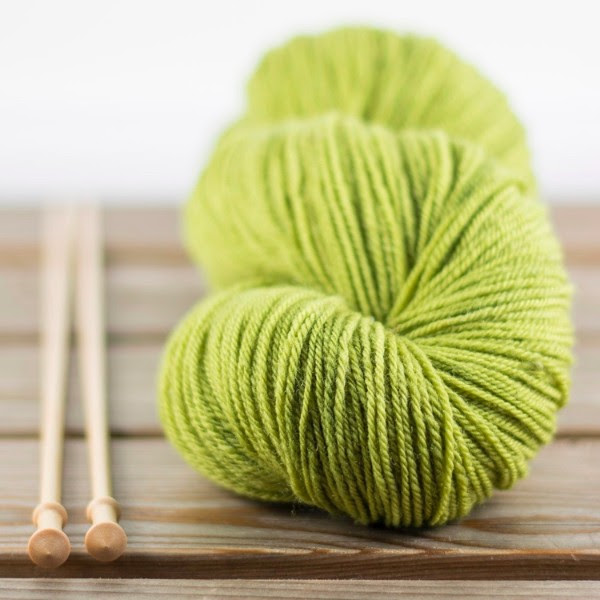
Clun Forest Sport in Inchworm, a tint of yellow-green.
There are also tones, which are hues with gray added to them.
The value of a color is how light or dark it is on a scale relative to white; the brighter the hue, the higher value it has.
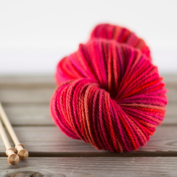
Columbia Aran in Blood Orange; most of the colors in this semi-solid skein are shades of red-orange.
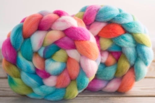
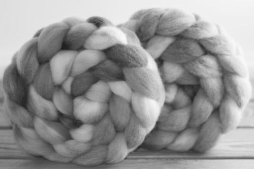
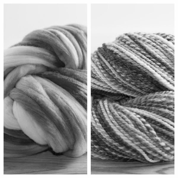
It can sometimes be difficult to tell which colors in a group are the brightest; one easy way to do so is to take a picture of the colors and then use a black and white filter to render the photo in shades of gray. I've done this below to make the range of values in this Cheviot top (in "Gummi Bear") more clear.
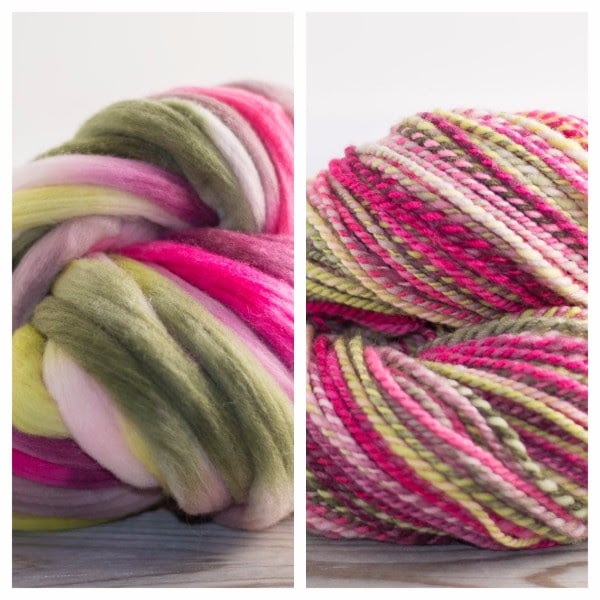
It's important to consider value when combining colors. Fair Isle knitting, for example, requires colors of different values to make the patterns pop. In spinning, thinking about value can help you predict which fibers will "barber-pole" when plied; the greater the range of values, the more obvious the barber-pole. Below is a picture of Targhee top in "Cultivate" and the yarn I spun from it. Because there's a big range of values in the colorway, the barber-poling in the final yarn is quite evident.
Next week, I'll share with you one final aspect of color—saturation—and then I'll give you some tips for using color theory to create color combinations.
If you'd like information like this, along with sneak peeks at upcoming yarns and fibers, delivered right to your inbox each week, sign up here to get my newsletter! You can also opt-in to get my e-course on choosing and using breed-specific wools as a special thank you!
